Thursday
Apr132006
New York City charts
INFO VISUALIZATION: Here are some charts I created for the New York City Demographics page on Wikipedia. For your viewing pleasure.
Key:
- New York City
- The Bronx
- Brooklyn
- Manhattan
- Queens
- Staten Island

New York City population, total and by borough, from 1900 to 2000. Figures in millions.
New York City population, total and by borough, from 1790 to 1890. Figures in millions.
New York City borough population from 1790 to 2000. Figures in millions.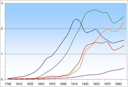
New York City population, total and by borough, from 1790 to 2000. Figures in millions.
 Julius Schorzman
Reader Comments (10)
what's the purple line?
im assuming staten island?
How can boroughs be over 100% on the "Percentage of NYC population growth" chart when no other boroughs are losing population (e.g., Brooklyn @ 175% around 1850, the Bronx in 1910)?
My naive understanding of the stat would say that the boroughs should sum up to 100% on this chart.
i'm guessing it is because it looks at the previous periods and not at the boroughs as a whole (so Brooklyn @ 175% in 1850, is a 175% growth in Brooklyn compared to the previous year)
Interesting, though not entirely surprising. I think it would be even more interesting to plot the demographics of the immigrant nationalities over time.
Never the less, Tufte would be proud. ;)
First, how hte heck can you confuse the 100%+ groeth rates? Did you not read the chart?
Secondly, the colros are too close.
Third, you should set it up so that clicking on one burrough's name inn the list shows only that burrough's linei n the graph in order to make it easier on color-blind readers.
Last, I do not think a line and percent growth is the right way to express this. Should be figures with total burrough size., with a line for the percent growth (like showing both the velocity and aceleration of a particle).
Good try though, interesting subject matter.
Those graphs look nice. What software did you use? Also, where did you get the data?
It's Staten Iland?
... Is purple
Well guys if you can do it so much better do it your self... but still i think u accedently used 175% (even though its possible 100 people ---> 375)
good work dude :D